Flat plan rational
Cover
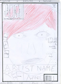
For the front cover I chose just one main image. Its a close up of the feature girl just like on the NME magazine I researched. I like the style because it's very much in your face and because my magazine is for younger people , the image appeals more to them. The Image will be accompanied by a title below in the colour Black.
The logo is in the top left hand side like most magazines so it is easily seen on shelves. The logo will be in white because it contrasts with the red hair and makes the title stand out more. The top will also be filled with a skyline containing extra information that may persuade someone to buy the mag.
To the left and right of the girls face , there will be other small images of other features and the captions and text will be in white which will stand out.
At the bottom will be another sell line , competitions to entice readers and the usual barcode & price found on most other magazines.
As for the colour scheme , it is a traditional red white and black , these colour match the main picture well.
Contents
Images with captions and the magazine name will take up a large proportion of the left hand side. Lots of images appeal to readers which is why they are placed there. The colour scheme will remain the same (easy to read and attractive).
The text will go down the left hand side for easy reading. The contents page is very simple and not too cluttered with information which is what the readers want.
There will be small sell lines at the bottom too.
DPS
The DPS is very simple , big image on the left , this is great for catching the readers eye and informs them who the artist is. The image is followed with a quote which allows the reader to sum up their attitude. Information and text is on the left , accompanied by a title for easy reading.


