I asked 4 people to look at a magazine cover , contents page and DPS and answer questions about them , here are their responses :
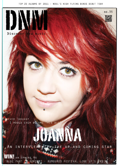
What is your first impression of this magazine cover?
2: Gives the impression of being a rock magazine, not pop at all
1: it stands out with the bright colours and the artists is directly at you
Is It obvious what the magazine is about?
Yes
1:no
2:yes
3:yes
4:yes
Is it clear who the suggested audience is?
1:Yes
2:no
3:no
4:no
What do you like about the layout of the cover?
1:How there is a simple use of colour and the bright colour just stands out
2: By using only 3 main colours (red, white and black) the layout is very attractive.
3:quite plain with large image, is attractive and would stand out to me on a shelf.
Yes because its simple and easy to read
What don’t you like about the layout of the front cover?
1:The use of text and the shot of the image
2: there isn’t many sell lines or lists of other features within the magazine.
3:only focuses on one artist and would out buyers off if they weren’t particularly fond of this.
Might be abit no plain, nothing really eye catching apart from main image
Evaluation - The genre is not clear enough but layout and colour is good.
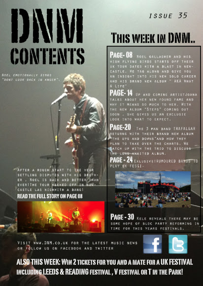
What do you like about the layout of the contents page?
1:The information is given clearly
2: The house style is very well laid out and eye catching.
Its clear and easy to read
What part of the contents page appeals to you most?
1:the image as it attracts the audience
2: the main image
3: colour scheme reflects the genre of music and a well structured layout.
The colour scheme and image
What doesn’t appeal to you about the contents page?
1: all the text
2: possibly the fact that the text at the right hand side is small and hard to read.
3: a subscription advertisement takes up most of the bottom of the magazine, making less room for content
4: the text looks like it would be quite difficult to read
Evaluation - Clear information but with a not so good layout , colour is good.

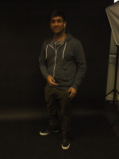
1: There is a larger image and less text
2: the main image spreads across both pages.
3: the main image reflects the personality of the band member and would encourage me to read more about the artist.
4: Looks like the artist is looking at you so its engaging
What does or doesn’t appeal to you about the DPS?
1: How bland the colour scheme is
2: The colours used as it is very dull
3: the lack of text and information about the artist
4: the text looks really small
overall :
Do you think there is anything unique/appealing about this magazine?
1: It’s specific genre
2: It reflect the type of music
3: you can tell what genre it is aimed at
What appeals most to you about this magazine?
1: the image as it tells the audience what I is about
2: its unique and would attract me due to the genre of music.
3: The layout as it isn’t to cluttered
Would do consider buying this magazine?
1:no
3:no
no
If so why?
If not why?
1|:it is very dull and there is too much text squashed
3: no because the featured artist doesn’t appeal to me.
Not my type of music
Not my style of music
Do you like the colour scheme?
Yes, simple and not too in your face
No it is very dull and the only use of diffrent colours are the images
yes
What do you think would make the magazine appeal more?
More images
1:Less text and more colours
brighter colours